Blog
Beautiful Form Follows Function
Serie S is something very special for those of us who work at REL. It is, in many ways, the heart of our lineup as it bridges the chasm between our more affordable offerings that benefit from innovations developed for the higher performance Serie S and the uber performance of our Reference subwoofers—for which we build into the mid-level Serie S as much Ref as we can possibly afford.
We sat down with REL’s Head of Design and Acoustic Development, John Hunter, and dove deeper into Serie S. Here are a few highlights from our conversation.
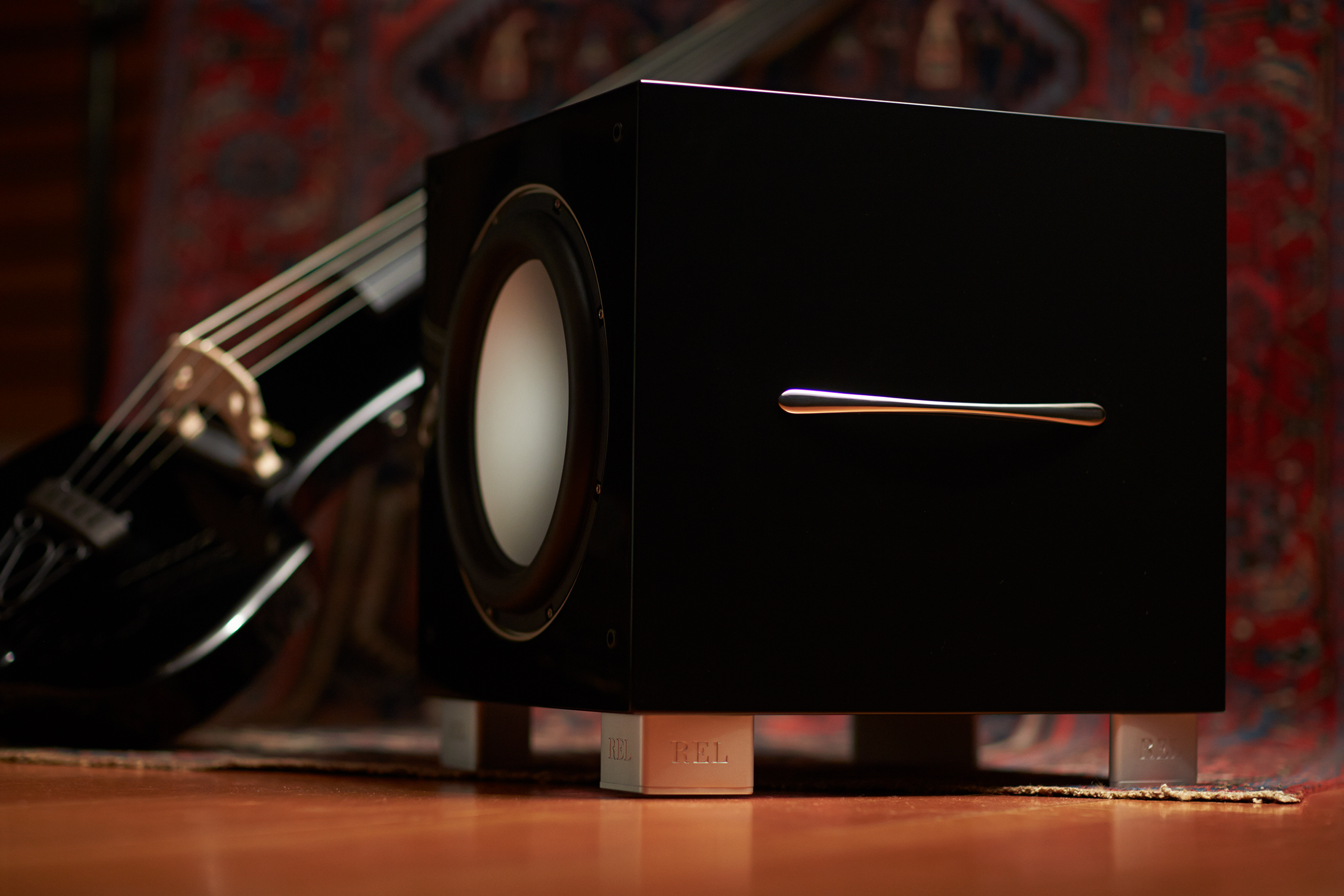 Q: Tell me about S, what is it about Serie S that gives it its air of sophistication and expense?
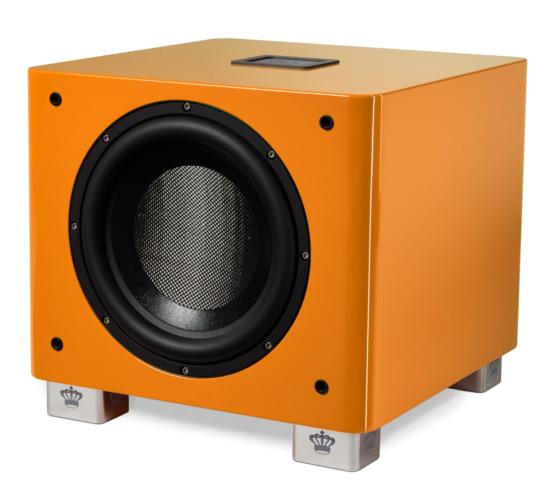
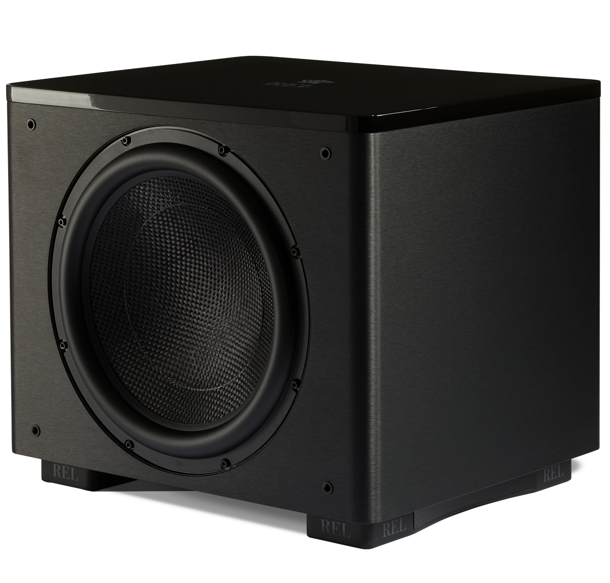
JH: Good question. At first, you see a Serie S and it is a simple thing, a simple cube like so many subwoofers before it, no? But then you begin studying it because something is a little different, a little more special. It is important that such profound performance—in both a visual and an acoustic sense–be well-grounded and so it begins at the feet which are complex and substantial. Very solid—which carries into the sound as they are responsible for evacuating excess energy so it does not clutter up the performance. Quiet and understated.
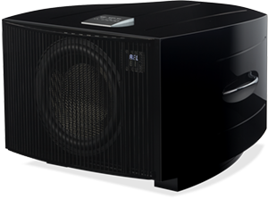
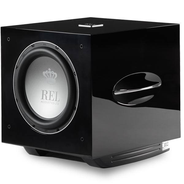
Then the eye travels upward and the normal boring side panels have these delicate strake lines milled into the side. We do that to break up the expanse of high reflectivity surfacing, to create interest and beauty. For S, I developed a lovely, organic high strength handles which we then plated in 3 layers of chrome—this also breaks the surface tension so the eye has somewhere to go. It is important for the eye to have little details to linger over—this is something my old mentor Franco Serblin (of Sonus faber) taught me.
Q: Is there anything about the design that benefits the performance or is it all about making a product beautiful?
JH: Almost everything we do adds function and performance– or both! (laughs). As an acoustic designer, the proportions are the hidden beauty of Serie S. As my career evolved, from set-up artist to product designer, I came to understand the importance of the Golden Mean to room design and later speaker cabinet proportions. A cube has a repeating ratio of 1:1 whereas a golden mean rectangle has a repeating multiple of 1.6218:1. We worked to stretch carefully the cabinet dims to get closer to a golden mean cabinet. Ultimately, acceptance of the product’s dimensions led us to shorten up some of the dims but we get closer than anyone else I know and you can hear it in the sound. It yields extra depth and a sense of vastness when the recording or movie supplies it.
Q: Anything I missed, any hidden stories buried in the product?
JH: When you look at the top we hope you see a beautifully crafted solid alloy badge that conveys strength and integrity. We see a tuning element. You see, the center of the top is perhaps the loudest resonance point in the entire chassis. So, we carefully developed a badge—right down to listening to various glues—that would fully damp this critical resonance point. Once we had the outer dimensions and weight correct to eliminate the resonance, I then went back and developed the curvilinear design that disguises just how large the badge is, but this is the first time we have discussed this critical, yet overlooked detail. Serie S has so many layers to it, once you start diving into the details of its design and engineering, it just keeps revealing layer after layer of universal principles, thoughtfully executed to give the line it’s distinct look and sound.

